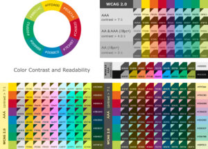
One of the most obvious issues we see with website accessibility has to do with color contrasts and combinations. The Web Content Accessibility Guidelines (WCAG) 2.1, provide recommendations and standards for web designers and developers to create accessible websites including the contrast ratio between text and its background.
What is "Contrast Ratio?"
Contrast ratio is a measure of the difference in brightness between the foreground elements (text or graphics) and the background. It is expressed as a ratio ranging from 1:1 (no contrast) to 21:1 (maximum contrast). The WCAG 2.1 recommends a minimum contrast ratio of 4.5:1 for normal text and 3:1 for large text (18 point or 14 point bold) and graphics. Hewing to these ratios make the text and graphics easily distinguishable from the background and readable or perceptible by people with low vision or color blindness.

How do you find a contrast ratio?
Contrast ratio is calculated based on the color values of the foreground and background colors. For example, black text on a white background has a contrast ratio of 21:1, which is the maximum possible contrast. Red text on a green background has a contrast ratio of only 1.06:1, which is not enough for most people to perceive the content easily. There are online tools to check your contrasts and highlight any errors. We use WebAIM's free tool here>>
The WCAG also recommends color combinations that do not rely solely on color to convey information. If a form requires users to select a specific option, using color alone to indicate the selected option is not enough for visually impaired users. Website designers should use additional visual cues, such as underlining or bolding the selected option.
How do contrast ratios obviate vision impairments?
Contrast ratios also play a crucial role in making sure that web content is accessible to people with color blindness. Color blindness affects approximately 8% of men and 0.5% of women of Northern European descent. There are three main types of color blindness: protanopia (red-green), deuteranopia (green-red), and tritanopia (blue-yellow). Each type of color blindness affects the ability to distinguish between certain colors.
To make web content accessible to people with color blindness, designers should use color combinations that are distinguishable even for people with color vision deficiencies. The WCAG helps with which color combinations are suitable for different types of color blindness. For example, for users with protanopia, blue and yellow are more easily distinguishable than red and green.
Need some help with your websites ADA Compliance?
If this seems like a lot to digest and implement, pondSoup is ready to help with your website ADA compliance. Contact us today to discuss an audit of your site.